

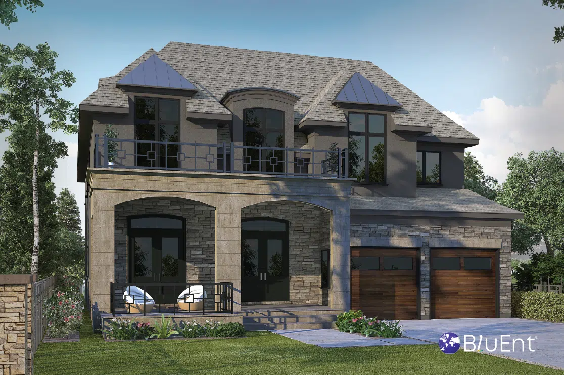
Interior rendering by BluEntCAD
Selecting a color palette for a commercial architecture project?
To give you a head start, BluEntCAD has put together this guide for colors for commercial spaces, such as offices, stores and factories.
Let’s dive in.
Table of Contents
Introduction
It may be tempting to automatically go for shades of white for a commercial architecture project, but there are many other color choices that will help your business.
The colors you choose for your walls and furnishings can leave an impression on customers and clients. It’s easy to ignore – until you get it wrong and watch your money start to disappear because no one wants to set foot in your cabin.
There are many things to consider when picking a color scheme for commercial building architecture: the nature of your business, the environment, and your customers, to name a few.
Of course, the easiest and most reliable way to pick the correct palette for your project is to consult a professional. Aside from that, there’s 3D interior rendering, which will enable you to see what your space will look like before it’s actually built.
However, it is important to have your own ideas before you reach for professional services. Furthermore, you should be aware of commonly used palettes or colors for various spaces.
How to Choose The Right Color Scheme for Your Commercial Architecture Project
1. Bear in Mind Color Psychology
It might seem trivial at first glance, but colors can affect us powerfully. They can set moods, trigger feelings, and set a tone for a brand. That’s why they feature so often in interior design trends.
Color psychology is not an exact science, and much depends on your audience and their individual moods, but there are a few broadly applicable guidelines. Blue and gray, for example, communicate objectivity and neutrality, and are hence good choices to encourage brand loyalty.
Here are some popular colors with their associations:
- Red: Leadership, perseverance, dynamism
- Black: Creation, foresight
- Dark blue: Organization, reliability, idealism
- White: Ease, unity, calmness, openness
- Pink: Friendliness, whimsy, lightheartedness
- Green: Growth, health, stability
- Orange: Energy, power
2. Your Brand Identity Matters
Does your business have a fixed color palette that it uses across its logo, cards, stationery, website, and signage? If so, consider using these colors, or slightly varied versions of them. This will increase your brand recognition by up to 80% and help you stand out.
3. What’s the Local Environment Like?
Even if you like the idea of using your brand colors, your building’s environment may not complement or even permit it.
For example, certain commercial areas, particularly historical ones, have regulations that restrict some colors. Take this into consideration and be mindful of every area’s historical, architectural and landscaping standards and laws.
If there are no such laws or rules, you can decide whether you want your building to blend in with the surroundings or stand out. For example, if you don’t want your building to stick out like a beacon, using darker colors will make it look smaller.
The Best Color Choices For Commercial Architecture
Here are some great choices that will help make your commercial architecture project look superb and increase brand recognition and loyalty.
-
Forest Green
This dark, rich tone is fantastic for a comforting, luxurious atmosphere. It would work well for a hotel lounge or an accent wall for a conference room. This color complements wood very well.
-
Soft Gray
This is a gorgeous choice for wall colors in multi-purpose commercial areas with plenty of natural light. It suits conference rooms, bakeries, and office work spaces well.
-
Modern Rust
Rust works well for a bohemian style, which is a blend of traditional elements and minimalist-contemporary designs. This is a warm, grounding color, and goes well with clean lines, indoor plants, and light woods.
It’s not always used for commercial building architecture projects, but it’s an eye catching and aesthetically pleasing choice.
-
Mid-Century White
Suppose you do have a restriction on colors, or that you just want to keep things simple. In these cases, there are many clean, trendy white tones at your disposal. A minimal white will work well for a hospital or dental waiting area, school or college classroom, or a boutique.
-
Cool Aqua
Do you need a color for mass appeal for a retail store, restaurant, or public area? Go for aqua, a cheerful, calming color that is almost universally liked.
Recommended Reading:
-
Deep Blue
A fantastic color for a modern office area or a feature wall. It is both powerful and relaxing, and can complement many other colors. However, it is particularly good when paired with cool gray or white tones, or with bold yellows or greens.
Since it is a dark color, we recommend using it in airy, bright commercial spaces with lighter floors.
-
Lilac Gray
Soothing, soft and surprisingly warm. Lilac gray is good for receptions or seating areas, and even works for smaller office cubicles. Furthermore, it’s a great complement to many furnishings, whether they use light or dark wood.
Since lilac gray is already quite a pretty color, we recommend pairing it with neutrals for professional spaces.
-
Golden Yellow
This color is surprisingly versatile, and works for both traditional office spaces and modern ones. It suits smaller spaces particularly well, since it adds depth and fun, but can also be used for a feature wall in a larger area.
-
Matte Brown
This color conveys seriousness, authority and warmth. It’s not eye catching the way yellow or blue is, but it’s certainly pleasing and classy.
To ensure it does not come off as too broody or intimidating, add lighter and brighter furnishings and accent pieces in tones of red, yellow or green.
Tips for Commercial Architecture Color Schemes:
Interior design ideas work best when you take several factors into account, after all.
-
Go for a contrast.
Try color blocking your space for a dramatic, sophisticated look. This would mean, for example, painting only the bottom half of your wall unit, which would make your space appear larger.
Furthermore, since the area to paint is relatively small, updating the color will be fairly inexpensive.
-
There is a time and place for both bright and neutral colors.
Restaurants, niche shops, retail stores, and smaller storefronts can all pull off bright colors. You could even potentially paint the whole building with them.
However, for projects such as office building architecture, a neutral exterior is usually a safer option. (Interiors are a different story, as we have covered). But “safe” doesn’t have to mean boring. You can offset your neutrals with bolder accents for an exterior that is appealing, but doesn’t stick out.
Conclusion
We hope that this article has given you a good starting point for your commercial architecture project!
If you’ve got an idea or design in mind, BluEntCAD is just a click away. Our photorealistic 3D rendering services will give you an accurate idea of what your project will look like before a single brick is laid or pot of paint is bought. This will save your business both money and time.
We serve commercial architecture companies, remodelers, large homebuilders, engineering companies, interior decorators, home designers, and remodelers. Check out our portfolio to see how we’ve helped other companies like yours.
Ready to make your modern commercial building design project a success with 3D rendering services? Contact us now!
Maximum Value. Achieved.


 How 3D Architectural Visualization Boosts Property Pre-Sales?
  A Guide to 3D Condo and Apartment Rendering for Residential Projects
  Details of Modern Ranch Style Open Floor Plans for Builders & Buyers
 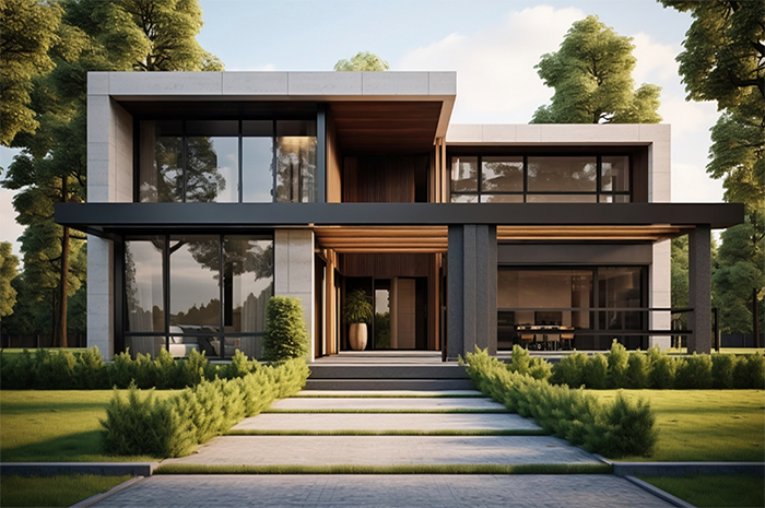 How 3D Landscape Designs for Exteriors Can Elevate your Property’s Value
Great Article! Thank you for sharing this very informative post, and looking forward to the latest one.
Thank you, Skye! We’re glad you found it helpful. If you would like us to cover any other topic, please let us know at info@bluentcad.com