


Along with elements such as custom millwork and fine dining restaurants, the right colors will bring together your hotel interior design to give your guests the perfect experience.
Here’s a list of our top picks when you are planning for hospitality interior design and some interesting tips on how to use them to make it stand out.
Table of Contents
Introduction
The right colors to use won’t always depend on hotel design trends. Much depends on color psychology and the purpose of your hotel.
For example, if you’re focusing on a luxury hotel interior design, you may go for beiges, creams, or grays, which provide a sumptuous and tranquil air. What’s more, the colors you use in a hotel won’t necessarily be the same as the ones you use in, say, commercial architecture.
You also need to account for the size of the space. Almost any color would work for a very large space, such as a big lobby, as long as it provides a cozy yet elegant atmosphere.
By contrast, a small space might benefit from paler, more calming hues that can give the impression of a larger space.
The Best Colors for Hotel Interior Design
You can use these interior design colors for all your walls or accent walls, depending on the final look you want to convey.
Beige
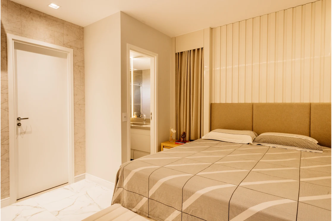
An excellent choice as a secondary or background color for hotel interior design. Beige, like other neutrals, invokes a sense of softness and calmness, and when layered with other neutrals, results in an elegant, sophisticated palette.
Colors that go well with beige include browns, reds, grays and blacks. Some combinations you may want to try are:
-
Beige & white: warm and minimalist
-
Beige & sage: welcoming and striking
-
Beige & gray: refined and simple
-
Beige & emerald: intense and luxurious
-
Beige & almond: subtle and calm
-
Beige & caramel: timeless and warm
Pair beige hues with textures, such as wood furniture, stone elements, and fabrics to provide both visual interest and a sense of comfort. Modern monochromatic artwork and black or white accents also go well with this color.
White

Interior rendering of white bathroom by BluEntCAD
Contrary to popular assumption, there are many shades of white, such as pearl, eggshell, lace, and champagne.
White can be associated with cleanliness, purity, and perfection, which could work wonders for good hotel reviews, since guests place emphasis on hygiene. It also creates the illusion of a larger space, so it’s useful for smaller or cramped areas.
However, white also highlights the smallest specks of dirt or imperfections, so areas painted white require regular maintenance.
Furthermore, white could also create a clinical, sterile or cool ambiance, so you might want to only use it for washrooms if you’re aiming for a “home away from home” feel.
Here are some ways to spruce up a white space:
-
For a graphic effect, pair white with black.
-
It goes well with warm wooden floors and accents for an earthier feel. On that note, you can use natural elements and organic finishes.
-
Try textured ceramics, linens, and other “imperfections” to add visual interest.
-
A white backdrop is excellent for a gallery-like area, so if you’re showcasing artworks, sculptures, or furniture, go for it.
Blue
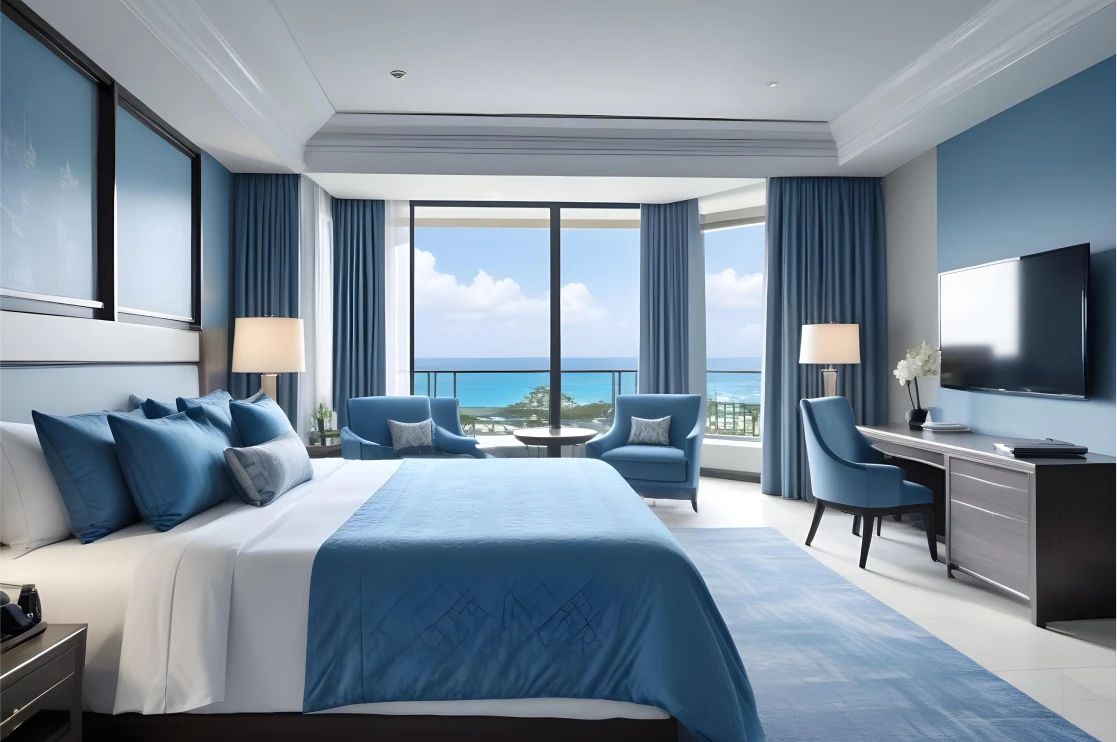
Blue is another universally liked color, and there’s a reason it’s used so often in the tourism and hospitality industry. You may want to use it in sunny or bright rooms with large windows, since it can subdue the brightness and add a sense of cooling.
While blue does indicate calmness, a dark blue can invoke a melancholy mood for some people, so use darker shades judiciously.
-
For communal or gathering spaces, use warmer shades, such as turquoise or a soft sky blue.
-
If you have an area specifically meant to act a bit like an office, a serene hue like periwinkle, aqua or turquoise can work well. These colors also suit bedrooms and bathrooms.
-
Colors that pair well with blue include off-white, cream, marigold, burnt orange, and gray-brown.
Recommended Reading:
Brown
Brown goes with almost every other color, since it is a mixture of the primary colors, yellow, blue and red.
Use this rich hue for spaces that are supposed to feel welcoming and cosy, such as bedrooms, dining areas or other communal areas. For a sophisticated or serious environment, use a deeper, more muted tone.
To spruce up a brown space, use woodgrain furniture, faux fur carpets, pillows and throws, white linen, hardwood flooring, and rope-wrapped finishes. Brown walls can also be contrasted beautifully with paler furnishings.
Some color combinations you can try are:
-
Brown & gray: minimalist and calm
-
Brown & turquoise: playful and unconventional
-
Brown & white: warm and cosy
Yellow

Who said hospitality trends had to be boring?
Yellow is a bit unconventional, especially for large luxury hotels, but if you want to make your space seem inviting and cheerful, it will serve you well. It is especially suited to boutique hotels and high-end homestays.
-
If you don’t want to have all your walls painted yellow, a pale shade on the ceiling or an accent will work to your advantage. The latter will be especially effective in creating a conversation, reading or work nook.
-
The use of yellow largely depends on its hue. If you’re using a bright, saturated shade, you may want to stick to smaller accents.
-
A space full of natural light will be great as a backdrop for a rich yellow.
-
Rustic or traditional furnishings pair well with yellow.
-
For depth and interest, throw in shades of red, blue or peach.
Gray

Gray is a color of formality, sophistication and neutrality, and works well for both classic and modern looks. In the hands of the right hotel interior design experts, it can be a powerful tool to help attract guests.
-
An excellent choice for rooms that are meant for concentration or calmness, such as bedrooms or lounges.
-
Adding a single cool or warm color can make a great design statement.
-
Some colors that go well with gray are taupe, coral, denim blue and lime.
-
As with yellow, gray is a great color for boutique hotels if you know how to use it right.
Pink & Peach

Soft pink and peach hues add warmth and subtle sophistication to hotel interior design. Ideal for boutique hotel rooms, lounges, or luxury bedrooms, these colors create a welcoming and serene atmosphere.
Some combinations to consider:
-
Pink & cream: gentle and calming
-
Peach & beige: warm and elegant
-
Pink & gray: modern and refined
-
Peach & gold: luxurious and inviting
Pair pink and peach tones with textured fabrics, wooden furnishings, or metallic accents to enhance depth, comfort, and visual interest in hotel interiors.
2025 Update
Warm neutrals, earthy greens, terracotta, and muted jewel tones are trending in luxury hotel interior design.
Choosing Interior Colour Palette for Different Hotel Types & Styles
The right palette should reflect the hotel’s character and the emotions you want guests to feel. Colours work best when they connect to the hotel’s concept, audience and location.
Here’s how different types of hotels approach interior colours:
Luxury and High-End Hotel Interiors
Deep blues, emerald, ivory and metallic accents signal comfort and exclusivity. For a luxury room design these tones feel timeless and pair well with plush fabrics, stone, or wood for a polished look.
Boutique or Design-led Hotels Interiors
boutique hotel interior designers believe that Independent hotels often stand out with playful contrasts such as mustard with teal, or coral with charcoal. Bold combinations add personality and appeal to travellers seeking something distinctive.
Business Hotels Interiors
Neutral backdrops with muted blues, greys and warm whites create a calm setting that supports focus during the day such as a bright open lobby. While, an intimate bar area would go resonate with greys and burgundies.
Heritage or Culturally Inspired Hotels
Rich earth tones like terracotta, ochre and olive reflect tradition and craftsmanship, giving spaces an inviting, rooted feel. Adding textured fabrics, handcrafted furniture, or subtle metallic accents can further enhance the authentic ambiance.
Beachfront or Resort Hotel Interiors
Soft aquas, pale greens, turquoise, and sand-coloured neutrals are perfect for evoking a serene resort-like ambiance. Light, breezy textiles and natural materials like rattan or driftwood complement these colors beautifully.
Do you know?
The 60-30-10 Rule: Use a primary color for about 60% of the space, a secondary color for 30%, and an accent color for 10% to create a balanced and harmonious scheme.
Role of AI in Modern Hotel Design
AI in hotel interior design is giving hospitality designers new ways to plan and refine spaces speedily, appropriately and without losing creativity.
Here’s how it adds value:
-
Data-driven colour ideas: Top hotel interior designers analyse trends, guest preferences and colour psychology to suggest palettes that fit each hotel’s mood and brand.
-
Better visualisation: Creates photorealistic 3D models and virtual walkthroughs so clients can explore hotel room interior design ideas and finishes before build-out.
-
Smarter design choices: The New improved tools with AI recommend material, lighting and layout combinations that balance aesthetics and function.
-
Faster workflows: Automates repetitive tasks and generates multiple concepts quickly, freeing hospitality interior design specialists to focus on innovation.
Used thoughtfully, AI helps hotel interior designers make decisions that feel both creative and grounded in guest experience.
Conclusion
With the right colors, your hotel interior design can tell the right story to the right clientele.
To see how various color schemes, patterns and textures will look before they are put in place, use photorealistic 3D rendering services.
BluEntCAD is an architectural rendering company that caters to architectural companies, interior design companies, homebuilders, real estate developers, renovators, and design build contractors for large to medium sized projects.
Ready to make your hospitality project a success with 3D product rendering and architectural fly throughs? Contact us now!
Frequently Asked Questions
What is the best color palette for a hotel?It depends on your hotel’s style and guests. Neutral tones like beige, cream, and grey with warm accents work well for most spaces, while boutique or themed hotels can use bolder, brand-specific hues.
What is the most luxurious interior color?Deep, rich shades like emerald green, navy, charcoal, and burgundy often feel the most high-end, especially when paired with metallics or plush textures.
Which colours can make a small hotel room interior feel larger?Soft neutrals like off-white, pale peach, or muted terracotta reflect light and make compact hotel room interior design feel open and airy.
What is ‘color capping’ and why is it useful for hotel interiors?“Color capping” layers shades from the same hue i.e. light on walls, mid-tones on trim, and deeper colours on ceilings. This is done to draw the eye upward and introduce architectural drama without overpowering a space.
Do pastel tones hold up better than white in real-world hotel settings?Yes, very pale pinks provide brightness like white but with softer character and spatial clarity. These are indeed a fav choice for hotel interior designers as it offers warmth without feeling cold or clinical.
What unexpected color pairings work well with greens for hotel interior design?Fresh combinations like emerald green with gold, sage with peach, or deep green with pink bring elegance and personality to hotel interior design projects.
How do warm and cool colors affect ambiance in different hotel interior areas?Cool tones like blue and green create calm hotel interior design for guest rooms or spas, while warm hues like red or yellow energize lobbies and dining areas.
Can color influence food experience in hotel dining spaces?Yes, warm shades like red and yellow in restaurant or bar interiors can enhance appetite and social interaction, improving the overall hospitality interior design experience.


 3D Office Rendering – 5 Photorealistic Luxury Home Office Visualization Styles Architects Are Requesting
  Best 3D Custom Wardrobe Designs for Your Bedroom
  7 Stunning 3D Kitchen Design Ideas for a Perfect Remodel
  Shaker Style Furniture Trends and Key Elements Every Furniture Designer Should Know