

Along with elements such as custom millwork and fine dining restaurants, the right colors will bring together your hotel interior design to give your guests the perfect experience.
Here’s a list of our top picks, as well as tips on how to use them.
Table of Contents
Introduction
The right colors to use won’t always depend on hotel design trends. Much depends on color psychology and the purpose of your hotel.
For example, if you’re focusing on a luxury hotel, you may go for beiges, creams, or grays, which provide a sumptuous and tranquil air. What’s more, the colors you use in a hotel won’t necessarily be the same as the ones you use in, say, commercial architecture.
You also need to account for the size of the space. Almost any color would work for a very large space, such as a big lobby, as long as it provides a cozy yet elegant atmosphere.
By contrast, a small space might benefit from paler, more calming hues that can give the impression of a larger space.
The Best Colors for Hotel Interior Design
You can use these interior design colors for all your walls or accent walls, depending on the final look you want to convey.
1. Beige
An excellent choice as a secondary or background color for hotel interior design. Beige, like other neutrals, invokes a sense of softness and calmness, and when layered with other neutrals, results in an elegant, sophisticated palette.
Colors that go well with beige include browns, reds, grays and blacks. Some combinations you may want to try are:
- Beige & white: warm and minimalist
- Beige & sage: welcoming and striking
- Beige & gray: refined and simple
- Beige & emerald: intense and luxurious
- Beige & almond: subtle and calm
- Beige & caramel: timeless and warm
Pair beige hues with textures, such as wood furniture, stone elements, and fabrics to provide both visual interest and a sense of comfort. Modern monochromatic artwork and black or white accents also go well with this color.
2. White
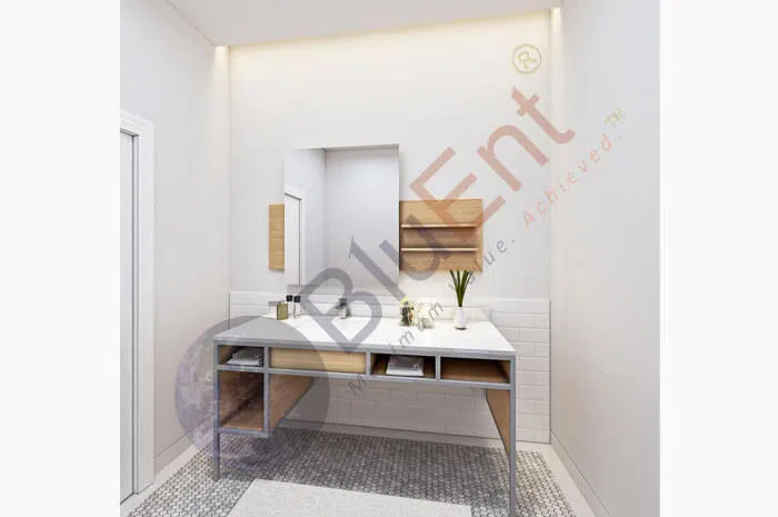 Interior rendering of white bathroom by BluEntCAD
Contrary to popular assumption, there are many shades of white, such as pearl, eggshell, lace, and champagne.
White can be associated with cleanliness, purity, and perfection, which could work wonders for good hotel reviews, since guests place emphasis on hygiene. It also creates the illusion of a larger space, so it’s useful for smaller or cramped areas.
However, white also highlights the smallest specks of dirt or imperfections, so areas painted white require regular maintenance.
Furthermore, white could also create a clinical, sterile or cool ambiance, so you might want to only use it for washrooms if you’re aiming for a “home away from home” feel.
Here are some ways to spruce up a white space:
- For a graphic effect, pair white with black.
- It goes well with warm wooden floors and accents for an earthier feel. On that note, you can use natural elements and organic finishes.
- Try textured ceramics, linens, and other “imperfections” to add visual interest.
- A white backdrop is excellent for a gallery-like area, so if you’re showcasing artworks, sculptures, or furniture, go for it.
3. Blue
Blue is another universally liked color, and there’s a reason it’s used so often in the tourism and hospitality industry. You may want to use it in sunny or bright rooms with large windows, since it can subdue the brightness and add a sense of cooling.
While blue does indicate calmness, a dark blue can invoke a melancholy mood for some people, so use darker shades judiciously.
- For communal or gathering spaces, use warmer shades, such as turquoise or a soft sky blue.
- If you have an area specifically meant to act a bit like an office, a serene hue like periwinkle, aqua or turquoise can work well. These colors also suit bedrooms and bathrooms.
- Colors that pair well with blue include off-white, cream, marigold, burnt orange, and gray-brown.
Recommended Reading:
4. Brown
Brown goes with almost every other color, since it is a mixture of the primary colors, yellow, blue and red.
Use this rich hue for spaces that are supposed to feel welcoming and cosy, such as bedrooms, dining areas or other communal areas. For a sophisticated or serious environment, use a deeper, more muted tone.
To spruce up a brown space, use woodgrain furniture, faux fur carpets, pillows and throws, white linen, hardwood flooring, and rope-wrapped finishes. Brown walls can also be contrasted beautifully with paler furnishings.
Some color combinations you can try are:
- Brown & gray: minimalist and calm
- Brown & turquoise: playful and unconventional
- Brown & white: warm and cosy
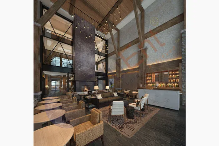 Interior rendering of hotel lobby decked out in brown by BluEntCAD
5. Yellow
Who said hospitality trends had to be boring?
Yellow is a bit unconventional, especially for large luxury hotels, but if you want to make your space seem inviting and cheerful, it will serve you well. It is especially suited to boutique hotels and high-end homestays.
- If you don’t want to have all your walls painted yellow, a pale shade on the ceiling or an accent will work to your advantage. The latter will be especially effective in creating a conversation, reading or work nook.
- The use of yellow largely depends on its hue. If you’re using a bright, saturated shade, you may want to stick to smaller accents.
- A space full of natural light will be great as a backdrop for a rich yellow.
- Rustic or traditional furnishings pair well with yellow.
- For depth and interest, throw in shades of red, blue or peach.
6. Gray
Gray is a color of formality, sophistication and neutrality, and works well for both classic and modern looks. In the hands of the right hotel interior design experts, it can be a powerful tool to help attract guests.
- An excellent choice for rooms that are meant for concentration or calmness, such as bedrooms or lounges.
- Adding a single cool or warm color can make a great design statement.
- Some colors that go well with gray are taupe, coral, denim blue and lime.
- As with yellow, gray is a great color for boutique hotels if you know how to use it right.
Conclusion
With the right colors, your hotel interior design can tell the right story to the right clientele.
To see how various color schemes, patterns and textures will look before they are put in place, use photorealistic 3D rendering services.
BluEntCAD is an architectural rendering company that caters to architectural companies, interior design companies, homebuilders, real estate developers, renovators, and design build contractors for large to medium sized projects.
Ready to make your hospitality project a success with 3D product rendering and architectural fly throughs? Contact us now!
Maximum Value. Achieved.


 Architectural Rendering: Revolutionizing Urban Planning for Future Cities
  Real Estate Virtual Staging: Avoid These Mistakes to Sell Your Home Fast (With Pro Tips)
  How Does 3D Rendering Help with Virtual Staging a House for Sale?
 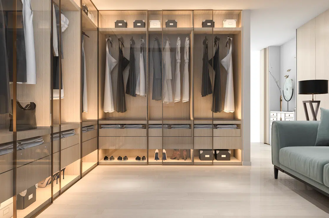 Best 3D Custom Wardrobe Designs for Your Bedroom